 Textaizer -
Help Textaizer -
Help |
3. Word art
Word
Art: pictures from words and small sentences
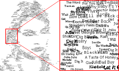
A special kind of picture can be created using the Word
Art option. The picture is built from a series of little sentences or words. The
example below shows what the effect of Word Art can be.
Word art controls
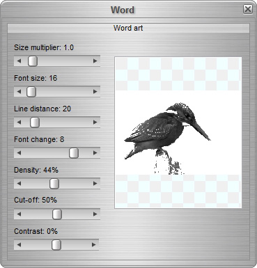
- (Bitmap) size
multiplier increases the size of the resulting bitmap. The maximum
value is 16x, the minimum 0.5x. For instance when a bitmap has 89x46
characters and is 1.5 Mb in size, a multiplier value of 2.0x will increase the
size to 178x92, and a size of 5.5Mb 9 (so: the end result becomes 4x the
size). With increasing sizes, the calculation time increases accordingly.
On slow systems, text mosaic creation may then take tens of seconds.
- Font size sets the size of the font. The font
typeface is defined in the 'Tools' tab ('Font settings'). When the font size is changed, the 'Line distance' setting follows the font size,
multiplied by 1.6 (to create sufficient visible space between
lines).
- Line
distance sets the distance between two lines of
text measured in font size points. When changing the font size, this value
follows, but it can be changed separately while keeping the font
size.
- Font change determines how often a word changes
font. The values can be set between 0 (no change) and 10 (maximum probability
of a change font).
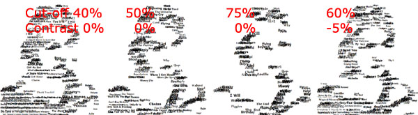
- The Cut-off value is comparable with ASCII Art:
the hight this value the more highlights will be cut-off from the Word Art
picture. In this case, a value of 0% may result in a very densely packed
picture where hardly any individual word is readable. A value of 100% usually
leads to a very thin result. The default is therefore 50%. Together with
the Contrast value the amount
and position of the words is determined. It may take a few trial and errors to
tune the setting to deliver a good result.The example below shows the effect
of both controls.
- Density: the distance between words is controlled
with this slider. A low density will result in less words 'per square cm', and
a high value of course the opposite.
Background and
tips
The Word Art option prints the text lines at the darker
areas of the source picture. The more lines are printed, the darker the 'colour'
impression will be. Some tips to create a good
Word Art picture:
- use pictures with a white background to assure that the
subject of interest (e.g. a portrait) is cut loose from the (lighter)
background
- use the pre-filters to tune the source picture to
satisfactory grey-values using the two filters Cut-off and Contrast.
- to find the best setting for a good surface coverage:
use a small font (e.g. 6-8) in combination with a short line distance (e.g.
4-8) (the 'Cut-off' and 'Contrast' values can be very helpful here, see also last tip)
- to create a print quality result: increase
the font size to 14-18 and keep the same short line distance for the final
picture and use the 'size multiplier' to
counterbalance for the increase of font size
- do not hesitate to increase the output size to
3000x3000 pixels or higher (use the 'Size multiplier', check the size in the status bar. Just
make sure that the size does not exceed the capabilities of the PC. There is a
bitmap size limit: with 4GB of RAM this limit is appr. 300 Mb picture
size.