Mosaizer Pro 12 -
Help Mosaizer Pro 12 -
Help |
Mosaizer Pro 12 -
Help
Transparent mosaics
Preamble:
please
be aware that this function is a highly professional and complex feature. To
work with chroma-keyed pictures requires a deep understanding of how this works,
and what
effects can
be achieved with a double layered mosaic. It is therefore highly recommended to
study and try-out this function prior to real mosaic creation. The manual
in this chapter provides a good start to work with this function, but
the user might still encounter issues
in
transparency and dig in the matter deeper than most
functions of Mosaizer Pro. Typical issues are insufficient chroma-key uniformity, green
pixels at the edges, less colour matching pictures in the final combination
with tiles. Please keep in mind that APP Helmond cannot provide
support for unlicensed users. What are transparent
mosaics?
Creating
transparent photo mosaics is a unique and unrivalled possibility of Mosaizer
Pro. It applies chroma-keying techniques to make a certain colour (range)
transparent. This approach is well known in the film industry and for
television shows. Although these industries use hardware chroma-keying, we use
real-time software chroma-keying algorithms. Another new feature is to apply a second layer on the original
photo mosaic, using the chroma key to leave out any unwanted colour. The
results are stunning and allows for a creative and wide variety of a new
generation of photo mosaics. In the picture below you can see the effect of the
chroma-key (here an example of a green screen picture + multiple backgrounds).
Even in Photoshop this is not an easy thing to achieve. Mosaizer Pro does it like
making just another photo mosaic. Transparency management
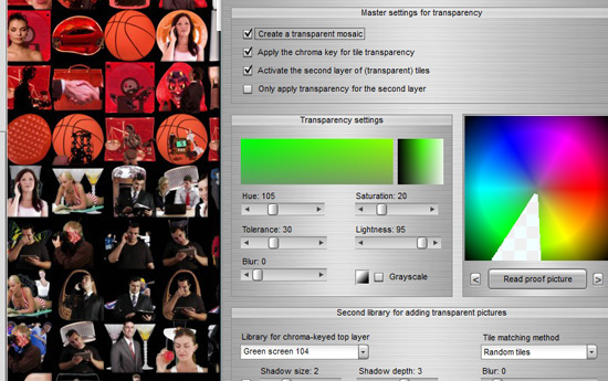
The picture above shows how to show the controls of the transparency
settings. There are three types of controls: Master settings for transparency
Combinations of
these three options must carefully be considered before
making the photo mosaic. For instance: you apply a .PNG picture library without
using the chroma-key, but you don't activate the transparency option for the mosaic. In
that case the tiles are 'transparent' when positioned on the mosaic canvas,
but the end result will have no alpha channel with the transparency data. If
also the option 'Random grid' is active, each picture in the
mosaic will be seen as transparent, but the final mosaic will not.
Except for the first option ('Create
a transparent mosaic')
these transparency features are in demo mode
for unlicensed users. A library of free (transparent) .png pictures can be
downloaded from our website. Here
is the link for download:
a variety
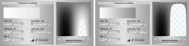
of coloured marbles. Transparency settings
A number of properties can be set to define the
chroma-key for transparency. The proof picture on the right shows which colours
will be made transparent. Because the HSL colour definition is a three
dimensional space it's almost impossible to show the effect of all three colour
components. The application has two internally available proof pictures, one for
colour and the other
for greyscale tones, starting from white. The proof
picture The proof picture on the right is a
specially prepared picture. The inner circle will show only hue and saturation values in their
entire range: the center has saturation 0 and the outer ring 100, with
a lightness of 50. The outer ring also only shows hue and
lightness values, while the saturation is 100. For that reason you will see an
abrupt change in transparency beyond the hue + saturation ring. The second picture
(press < or >) is for greyscales. The use
and effect is pretty straightforward. Some examples
are shown below. Top left: possible settings for a green screen. Top
right: similar for a blue screen. The user can load any picture for proof. By pressing the
'Read proof picture' button a new picture can be added
to the viewer. It will be stored, and by pressing the < or > buttons the
previous/next proof picture will be shown. There is no limit to the amount of proof
pictures. The list of proof pictures will not be saved however. Second library for adding transparent pictures
Here the second library of pictures can be defined. This
library is used for the top-layer of the photo mosaic, writing its tiles on the
first mosaic. The first mosaic is made like any other mosaic is made with the
settings that apply for a normal photo mosaic. The choice of the second
library is important. Some good practice:
Only a few settings
can be applied to this library:
Two examples of blur. Example one (picture below): the
correct use of blur. The top-layer library was composed from green screen
pictures, where the chroma key is accurately tuned with the (average) green
chroma key of the library. This was done by also reading one or more pictures
from the library in the proof image window. The blur was set to 3 for the
top-layer, and was set to 0 for the original coloured mosaic. The library for
this effect can be downloaded from our website (here
is the
link).
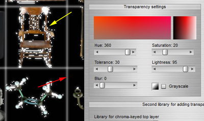
The following example shows what happens when a
chroma key is used for pictures that have scattered colours in the chroma key
range. The original picture had a lot of red that was supposed to be
chroma-keyed out. Unfortunately the library that was used was not really suited
for chroma keying. The yellow arrow shows the scattered transparencies, where
also blurring didn't help very much. The red arrow shows the edge effect
('halo') when the edges are not transparent. In this case better colour tuning
has to take place with perhaps a larger hue tolerance, while blur should be set
to 0. But it may be of no help after
all.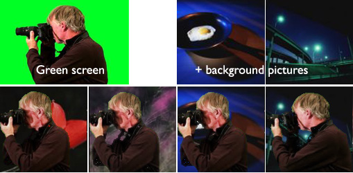
![]()
'Hue'. The colour tone of the chroma-key. This is
the basis for all
the colour transparency.
'Saturation'. The saturation range of the
chroma-key colours. It will make all colours transparent that have
higher saturations than indicated with this value (but only for the
Hue
range of course)
'Lightness'. The lightness range of the chroma-key
colours. It will make all colours transparent that have higher
lightness than indicated
with this value
'Tolerance'. The range of the hue of the colours.
Since hue is measured in degrees (0-360) the range can extend beyond 360 or 0.
In that case the hue is corrected. The tolerance can vary from 0 (mono
colour) to 100/360.
'Blur'. When a chroma key is applied the
edges between transparency and opague can be abrupt. This blur factor
smoothes that edge, allowing for a great professional chroma-key effect.
The effect of the blur is also seen in the proof
picture. A high blur can create a whitish halo around the
tile, so the blur should be carefully kept at the lowest possible value. A value of 2
is usually a good start. See also the remark on blurring in the paragraph
on blur for the second library (at the end
of this chapter).
'Greyscale'. In case pictures are used that need
to filter out the white colours, also a greyscale chroma-key can be applied.
This filter has some limitations compared with a colour chroma-key. It will
only respond to the 'Lightness' value, since saturaion and hue have no
meaning in this greyscale. The range of the
lightness also changes: where the lightness for a colour chroma-key varies between 0
and 1 (so 0 and 100 as values for lightness), the range for greyscale pictures
is 0 to 255. This reflects the true 256 levels from white to
black. The effect of the lightness can be seen by using a greyscale
proof picture (press any of the < or > buttons). All values lower than
the indicated value will become transparent. With the little black-white (toggle) icon you
can reverse the greyscale: in that case the black
will be made transparent, to a certain
level of grey.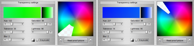
Bottom left: a great deal of the (white)
highlights are made transparent. Bottom right: subtle white removal.
Use .PNG files that have built-in transparency
information. Assure
that all pictures are indeed transparent.
Use files that have a white background,
avoid files that appear to have '1 pixel' coloured edges. The best
pictures are white with the parts of interest positioned in the center, and
have a good
fill-out of that part of interest.
Use pictures that have at least the size of the
end-tile to avoid pixelation of the chroma-key (not even
the blur can filter that out...)
The 'Tile matching
method': sometimes it makes sense to follow a different colour matching
method that the first original mosaic.
The 'Shadow size and
depth'. In case a 3D effect is required, this can be a useful setting.
For most mosaics this should better not be applied. Us the little checkbox on
the left to
activate or de-activate this shadow effect.
The
'Blur'. In case the second layer requires a different
blur than the original its value can be set here. It's very important
to manage the blur settings: when a square, but not transparent tile is
used for the layer the blur effect will create kind of 'halo' at the edges! For that reason blur can only be applied safely when the user is
sure that the edges are made transparent. A bit of trial and error may
be useful to
learn about the effects of blur.
Not in this control box, but the overall settings
for 'Blend' and 'Colourize' apply for the entire mosaic. In case these
settings are applied the blend and colourize effects
will be applied to both layers.